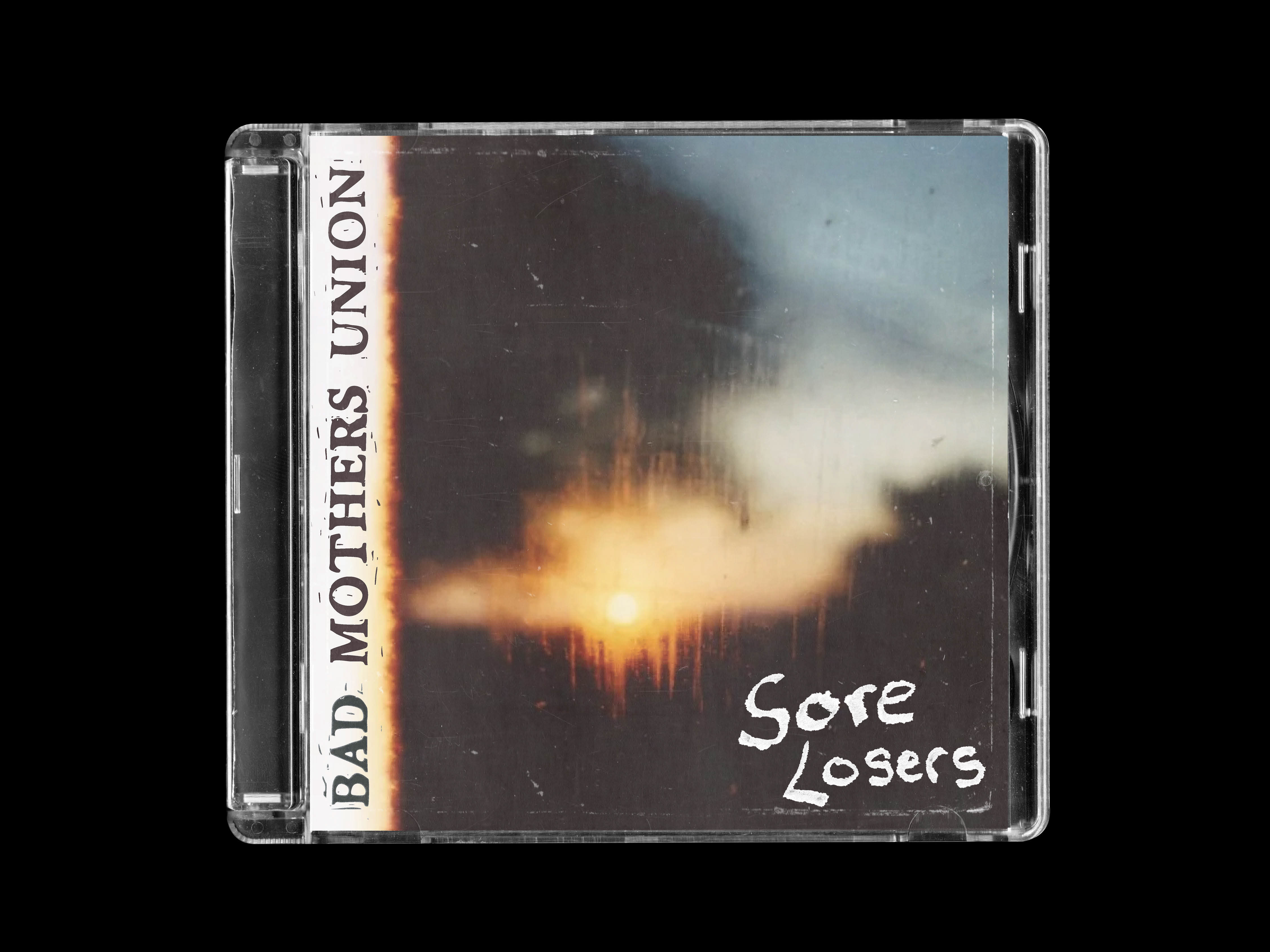
Bad Mothers Union
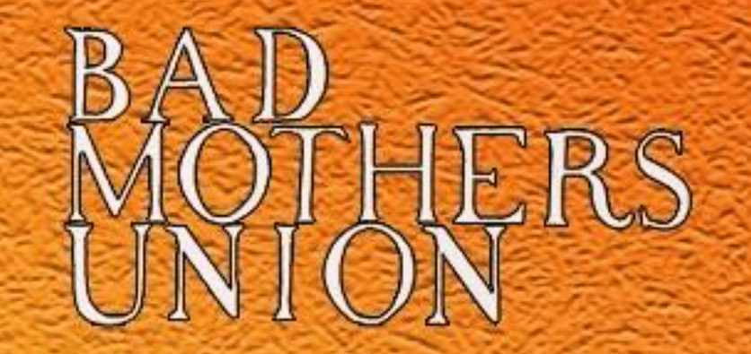
BMU’s logo started out as simple hand-drawn lettering, but frontman Conor Kavanagh felt the band needed something with more impact. Their original look was often getting lost in the noise of gig posters and social media feeds, so we set out to create a bolder design that would cut through and feel unmistakably theirs.
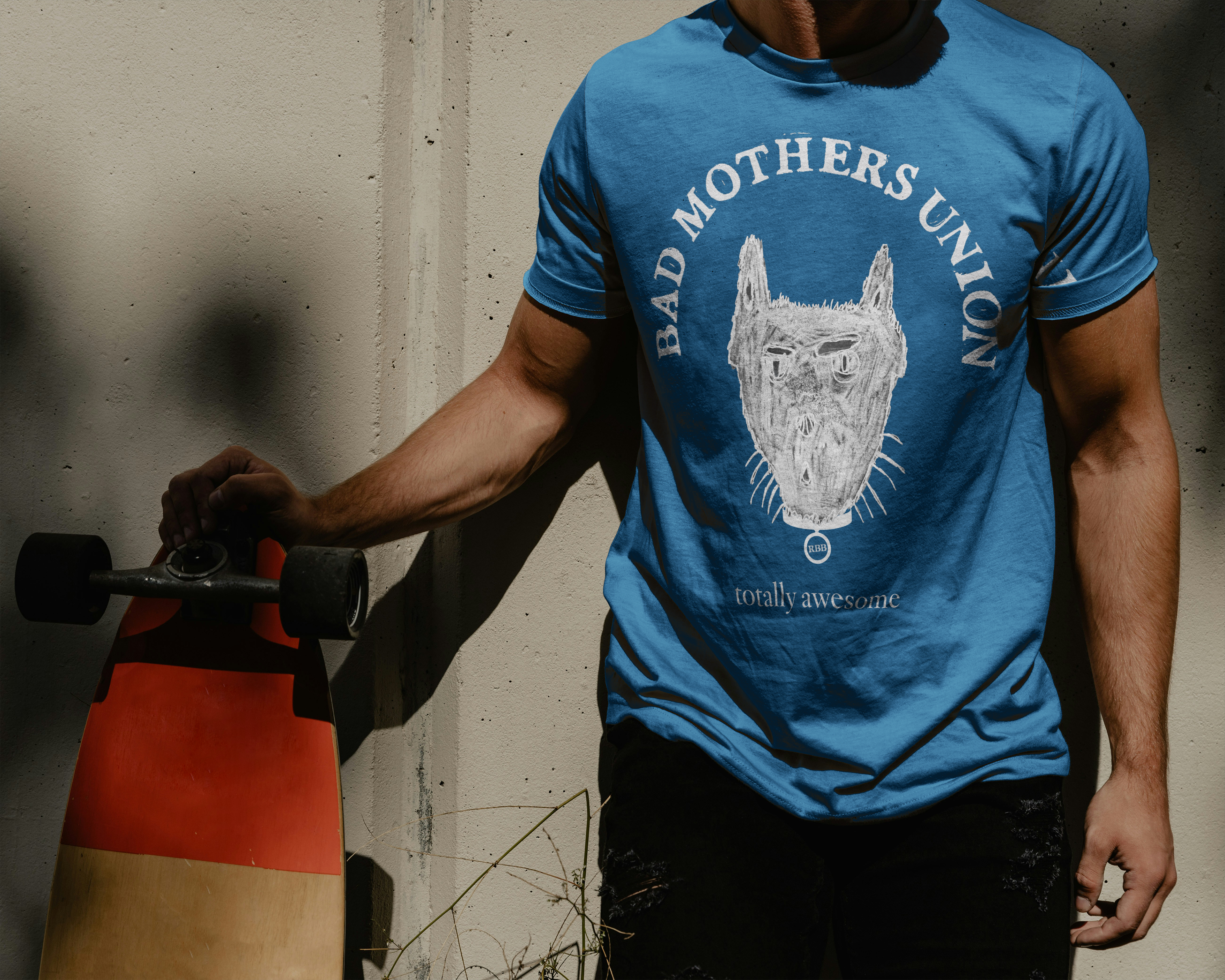
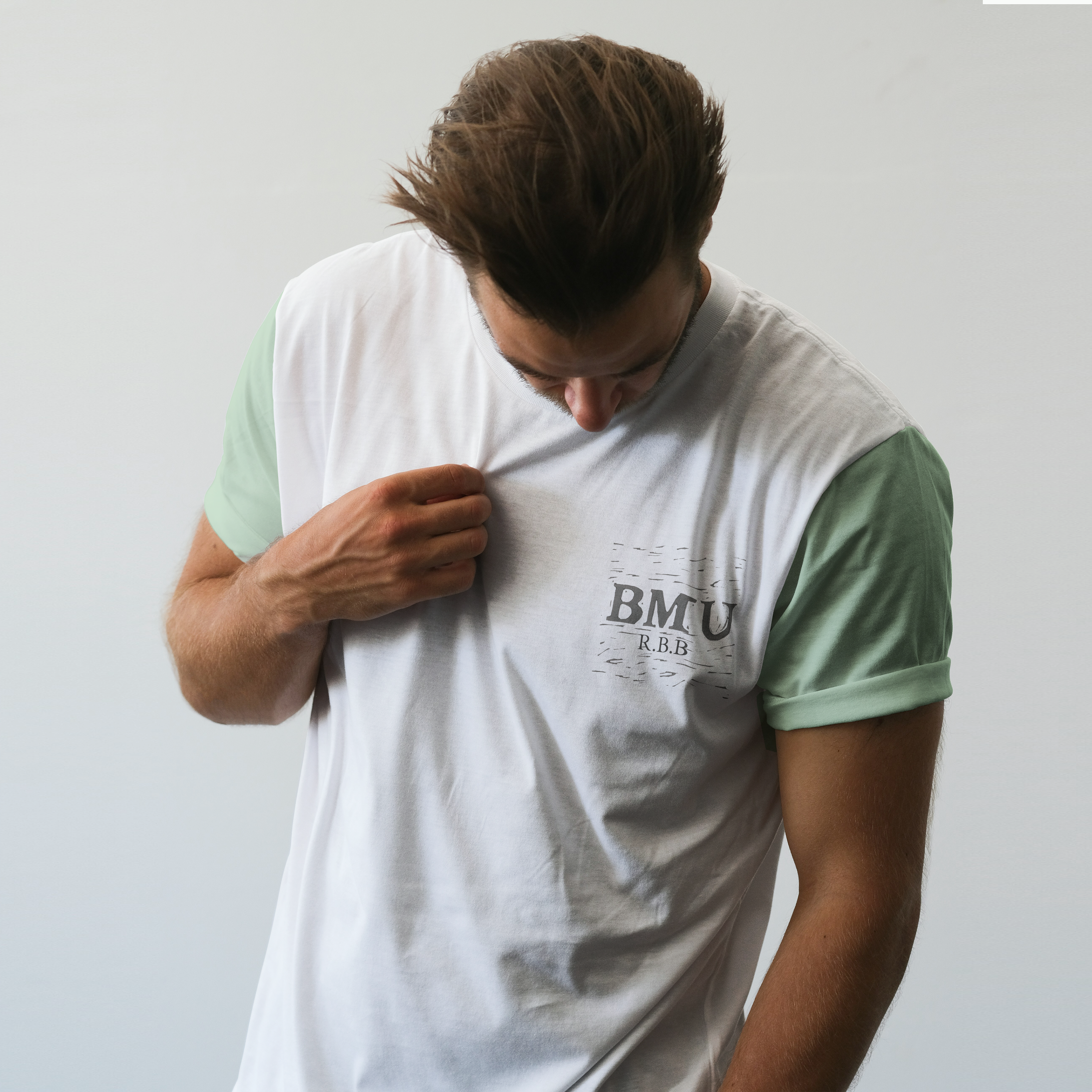
I developed a logo that leans into sharp, heavy lettering with a slightly chaotic edge—something that reflects their eclectic punk-noise sound.The design was built to be versatile: strong enough to stand on its own on posters and merch, but also adaptable across stickers, social posts, and other branding.
The result is a logo that doesn’t just identify the band, but amplifies their energy—loud, messy, and impossible to ignore.
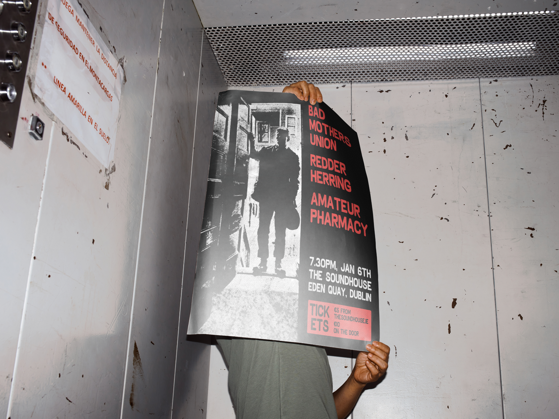
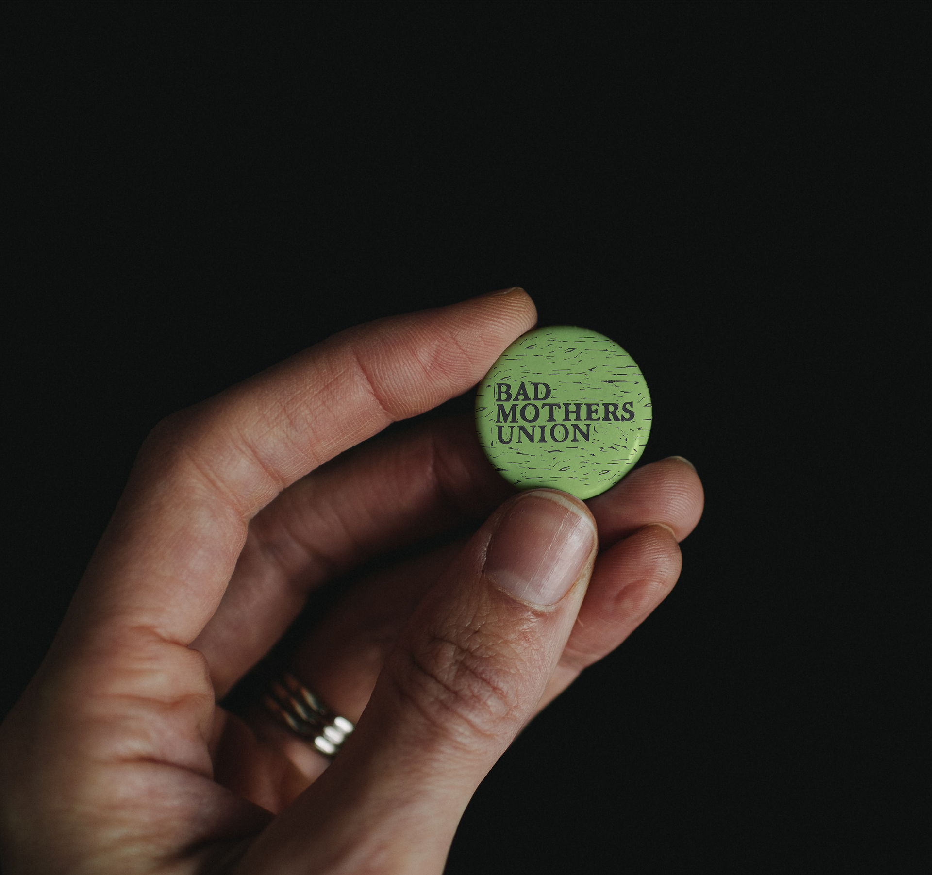
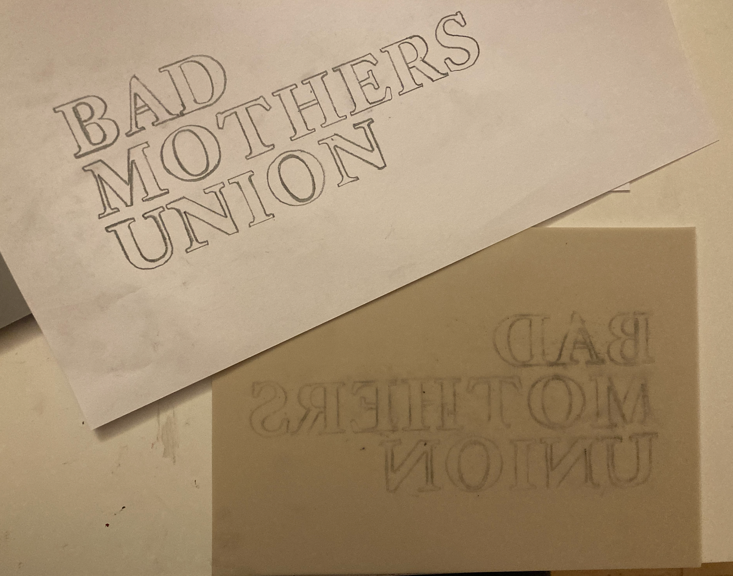
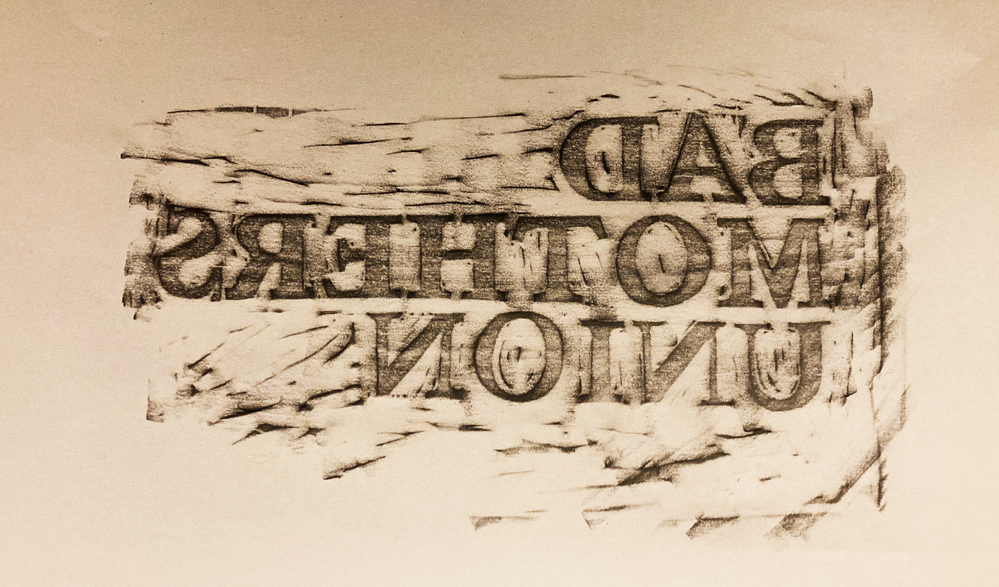
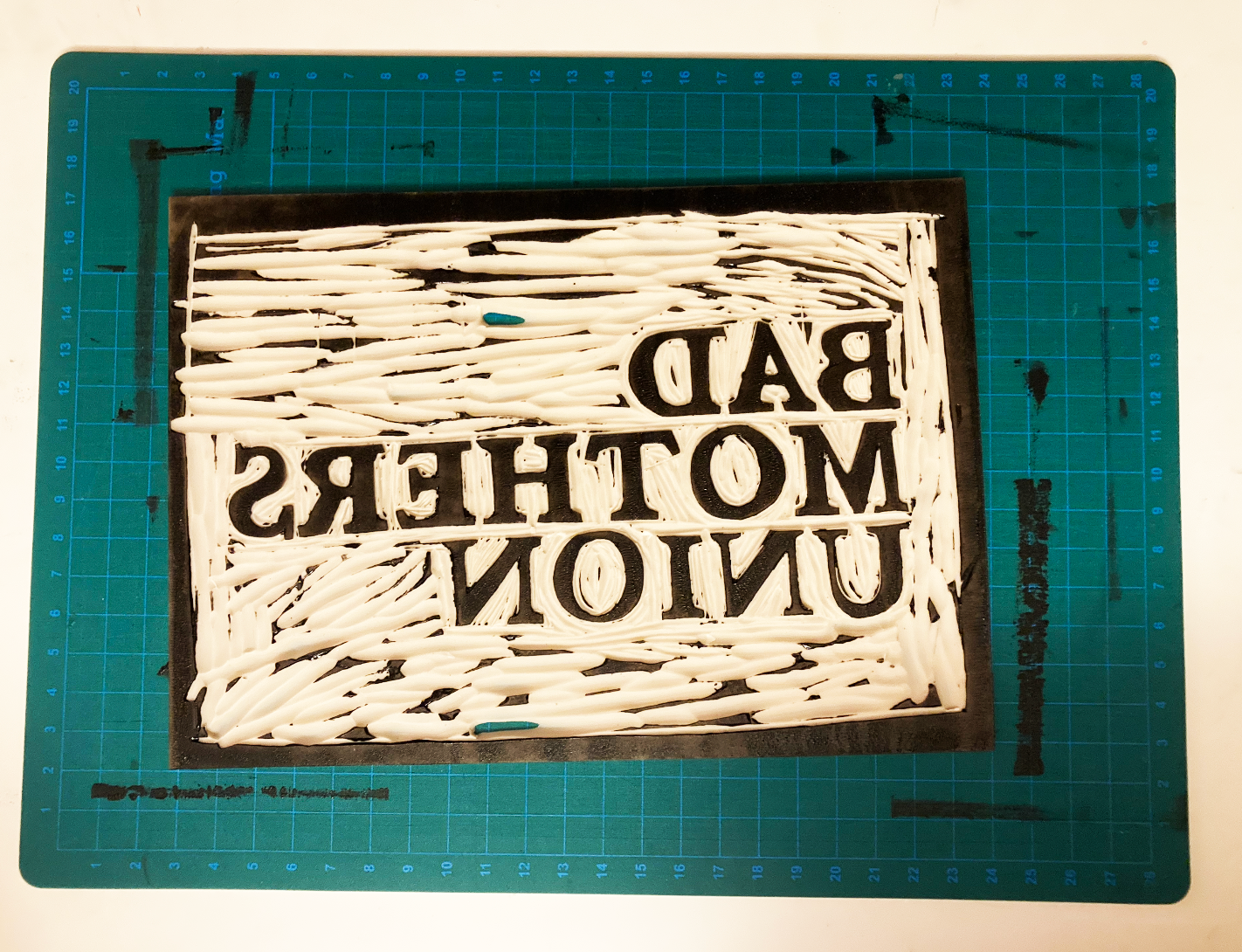
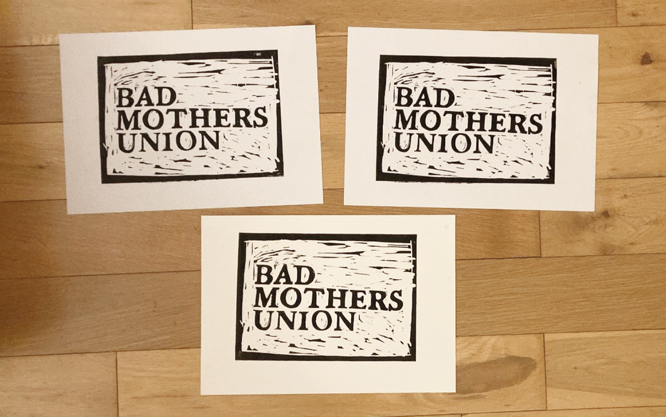
To keep the raw, DIY integrity of BMU’s original logo, I decided to recreate it as a lino print. I started by tracking down the original font and choosing a bolder variation that would carry more weight on posters and social media. From there, I carved and printed the design by hand, embracing the rough textures and imperfections that give lino prints their gritty character.
Once the prints were finished, I scanned them into Photoshop, cleaned up the details, and formatted the artwork into a finalized logo. The result is a design that stays true to the band’s DIY roots while giving them a sharper, more impactful visual identity.
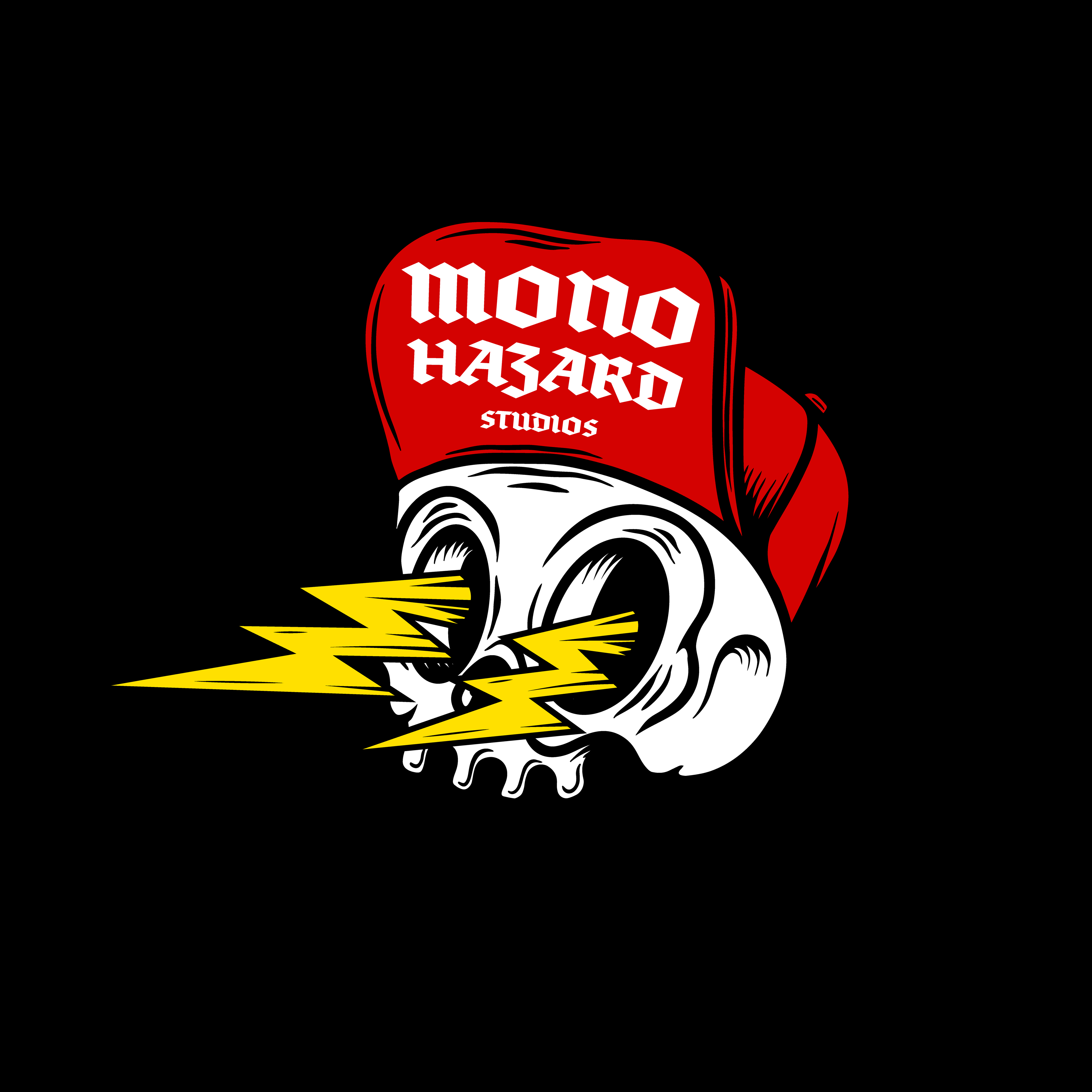
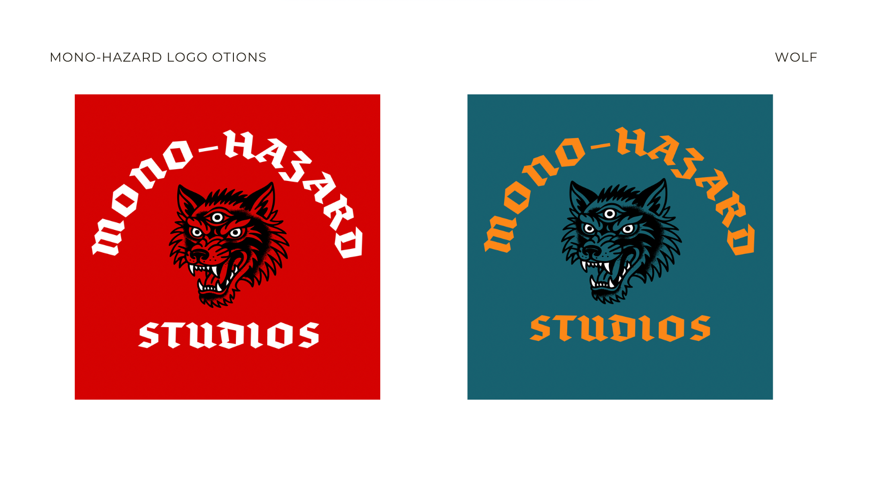
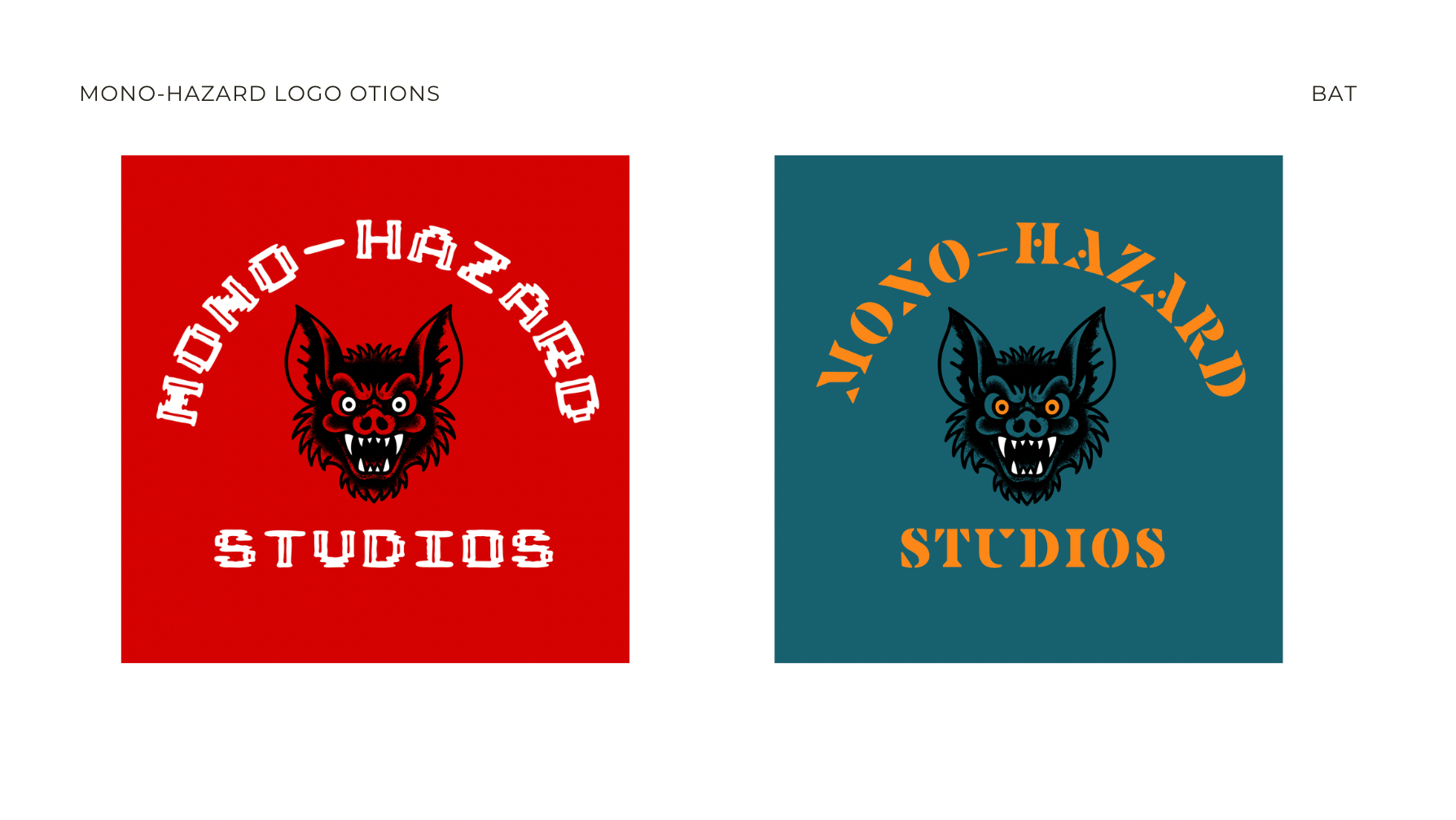
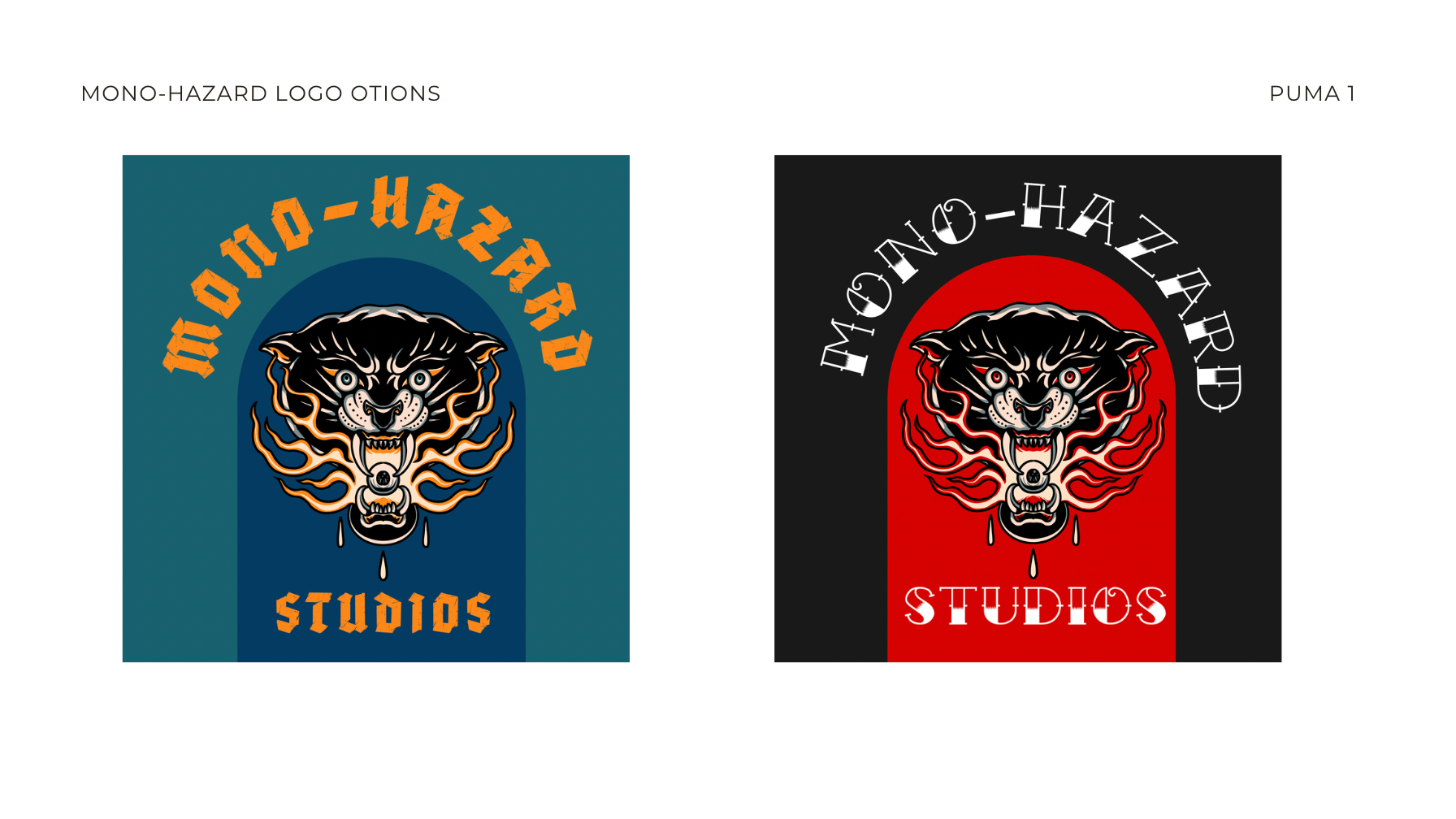
mono-hazard studios
Mono-Hazard studios is a small recording and mixing company in Waterford city. They were looking for a logo they felt represented their punk and subculture roots.
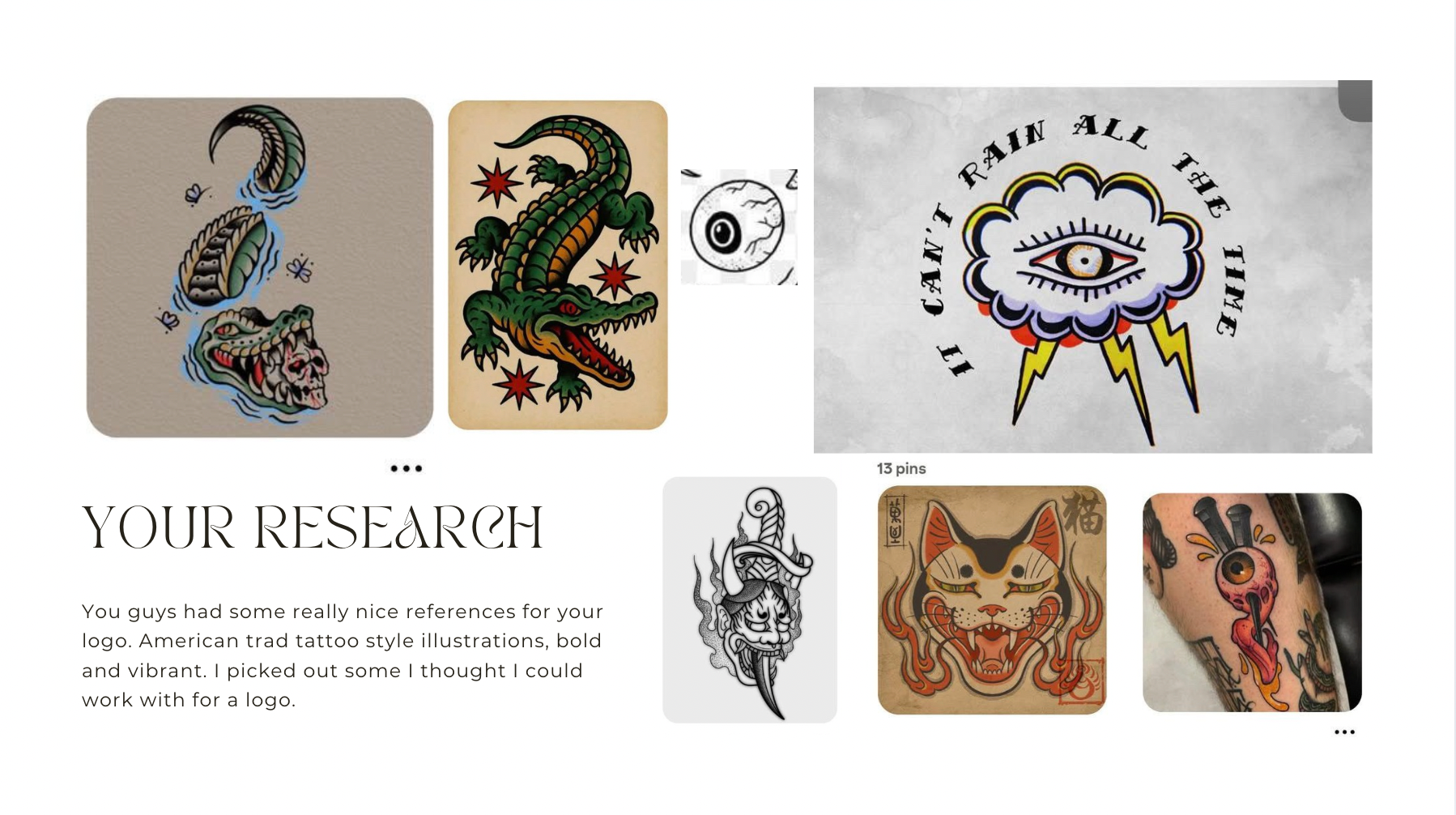
They sent me design references and they were particularly interested in American traditional tattoos. They wanted something vibrant, striking and cool.
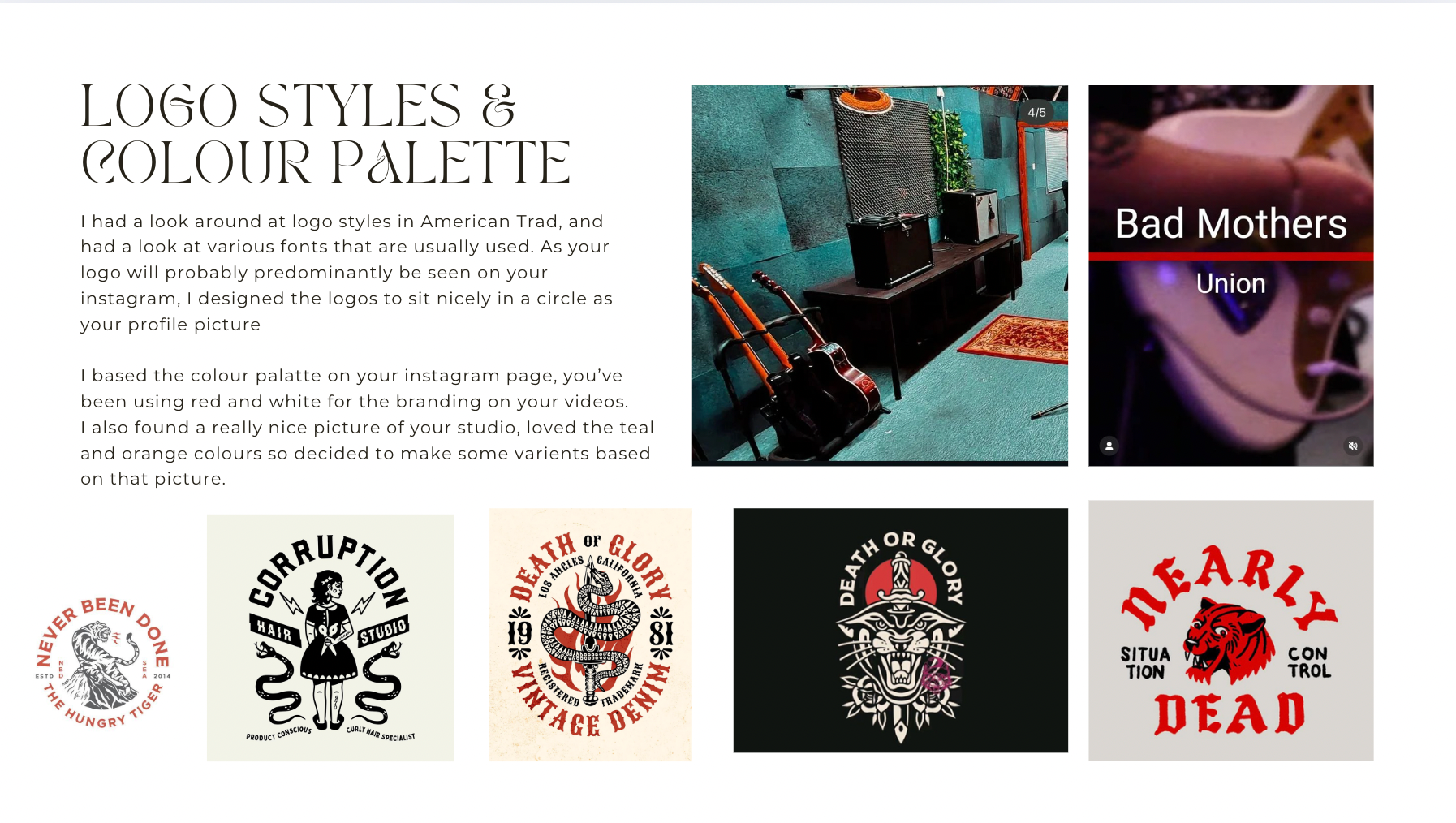
Below is a sample from the initial presentation I sent them with possible ideas for their design.
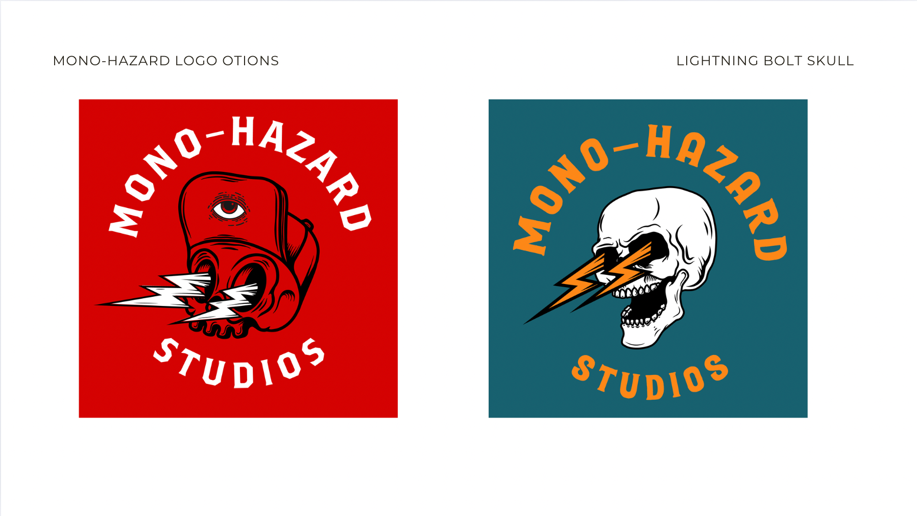
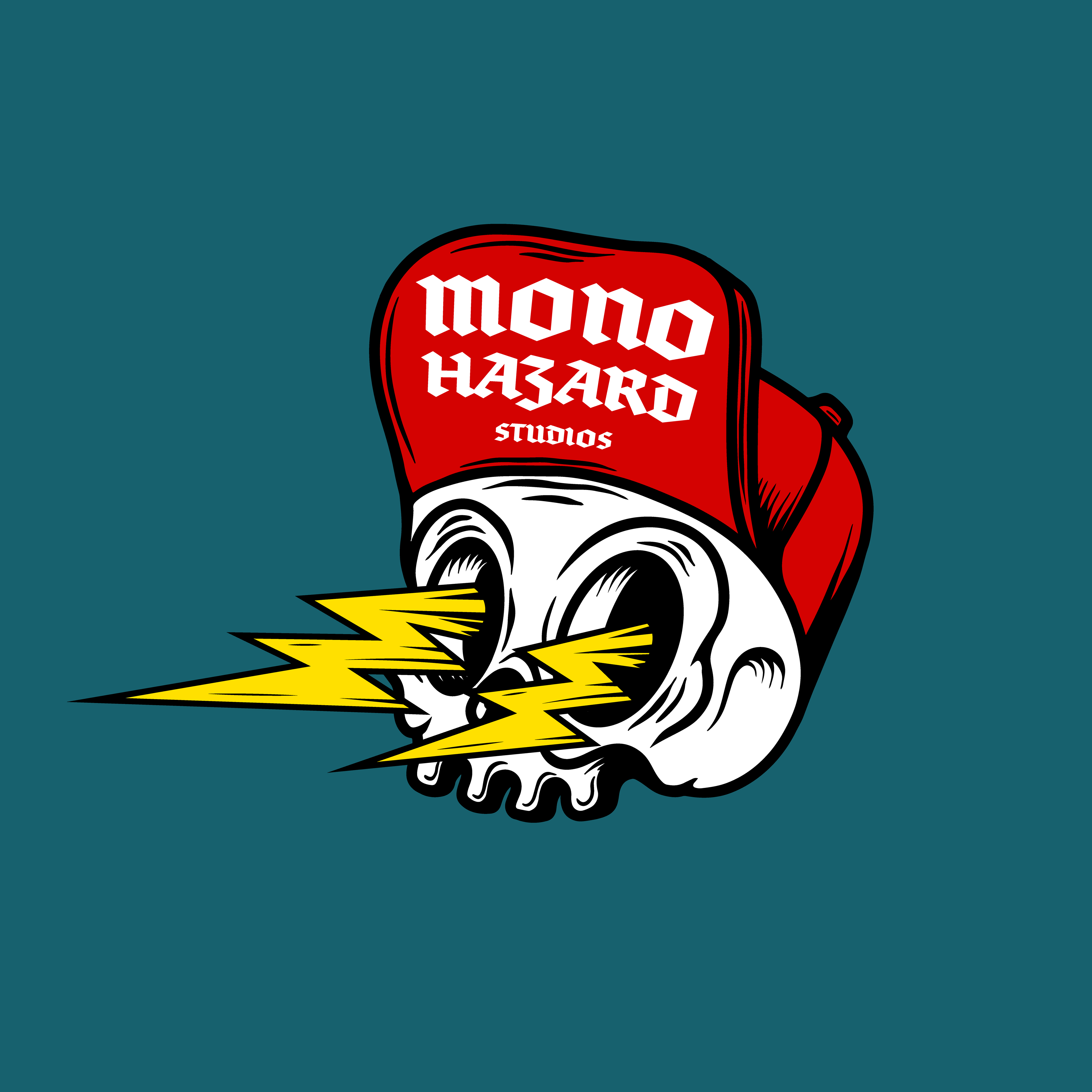
They loved this character skull so we made some palette and text adjustments and landed here with their new logo.