Anthology
Mary Black
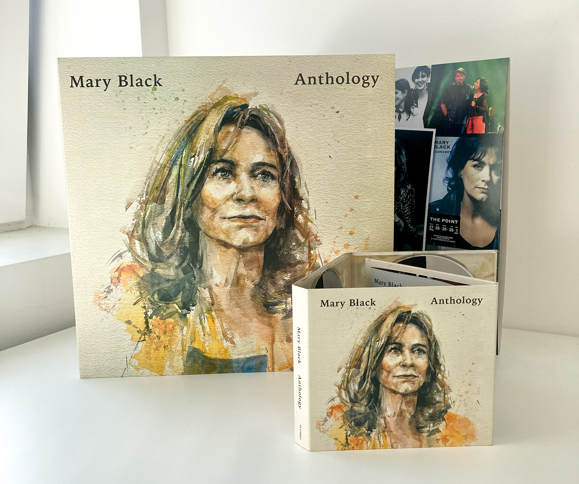
"The album was designed by the artist to represent both herself and her work over her decades-long career."
For the last quarter-century, singer Mary Black has been a dominant presence in Irish music, both at home and abroad. She has shared stages, tv shows and recording studios with some of the most revered performers of her time.

Album featured on The Late Late Show
Concept
Mary Black retired from her touring career in the summer of 2026. Her idea was to release a triple deluxe vinyl and CD to commemorate her expansive career as a gift to her fans.
The main feature of the album design is the interior spread, which showcases a huge collage of photographs and newspaper clippings of Mary and her band throughout her career.
We also included images of her full discography, a thoughtful message from both Theo Dorgan and Mary.
"As all of this draws to a close I was asked to compile an anthology from my catalogue. I have chosen the songs I love best and also the ones that I feel best represent me from beginning to end – I hope you enjoy it."


Sore Losers
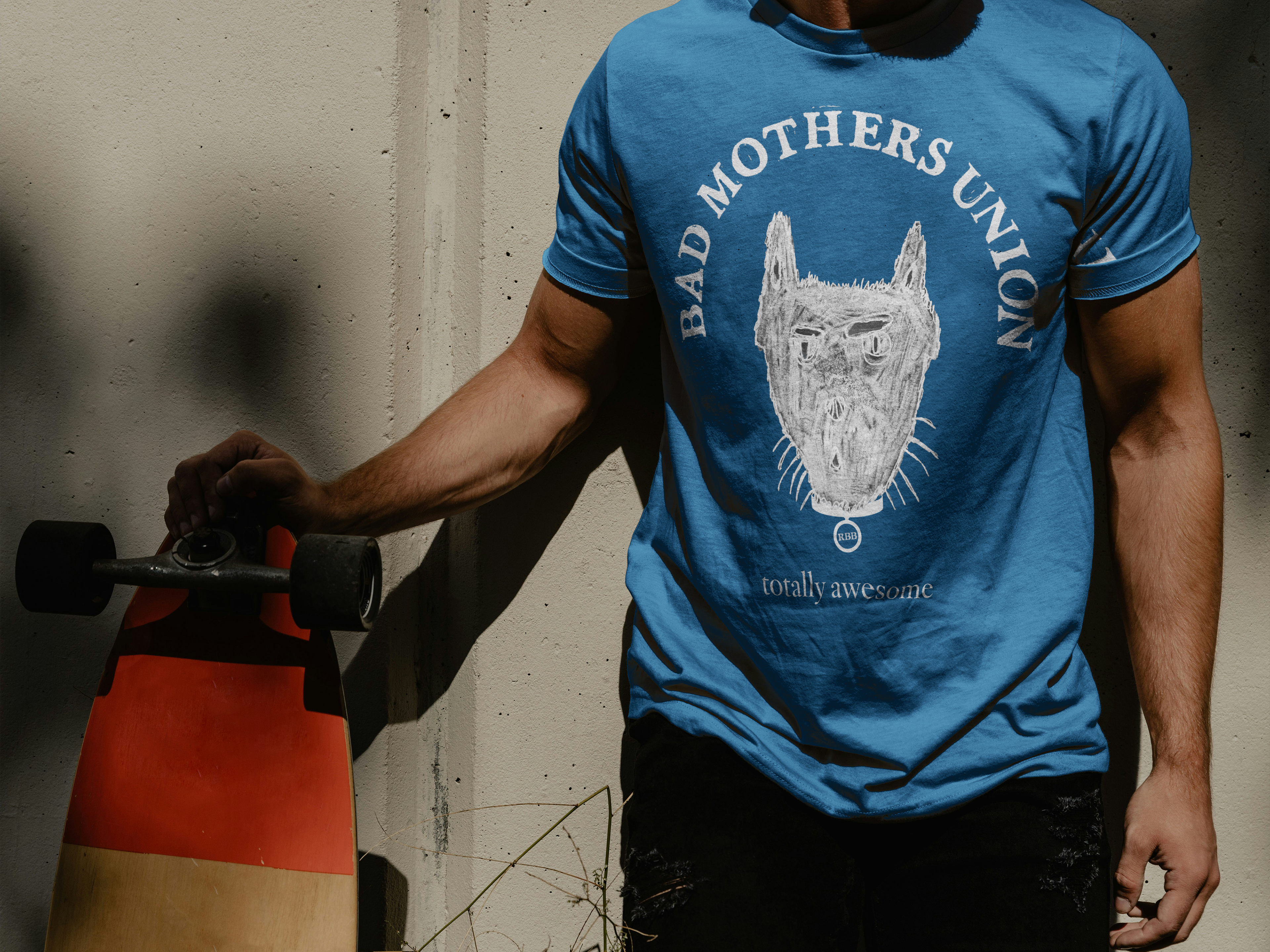
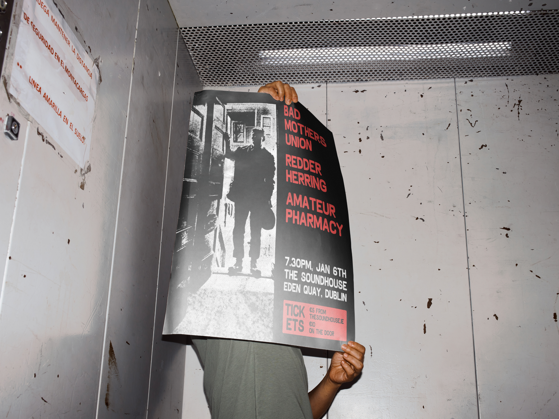
Bad Mothers Union
"A whirling dervish of unbridled self-expression, Bad Mothers Union unleash torrents of euphoric psych-rock."
Established in Kilkenny by frontman Conor Kavanagh, Bad Mothers Union’s existence has focused on forging a community of like-minded individuals, bands and artists with the view that no crowd or venue is too small.



Concept
BMU is a punk, noise rock band. They've a rough and ready attitude, and a distinct point of view for how they want their work to be perceived.
"This is music that needs to be created, that could not be kept inside and speaks to both worldly and celestial forces. Bad Mothers Union create moments of transcendence, sounds to get lost in, a blissful euphoria all concocted by a voice, drums, bass, guitar and some ska saxophone. A band that remains true to themselves and in that create their own gravitational pull."
Conor knew he wanted to use photography as the focus of the album artwork; "I had it in my head that I wanted a photograph cover, as opposed to a drawing. For some reason those are usually my favourite covers."
Using photography from James Kelly (@lavieengorg) I used imagery that had a melancholic and dreamy feel. I cobbled the artwork together using the lino printed logo I had previously designed, scans of my own handwriting, and featured photos taken by friends and family of Conor.
The tape labels feature 6 unique quotes, and 3 cassette colour ways. This introduced a uniqueness to each of the albums, so every fan could have a special piece particular to them
It was important for the design to feel personal, each tapes J-Card was hand folded, and the tapes labels were pealed and placed by the hands of the members.


Single Cover Artwork
Prologue
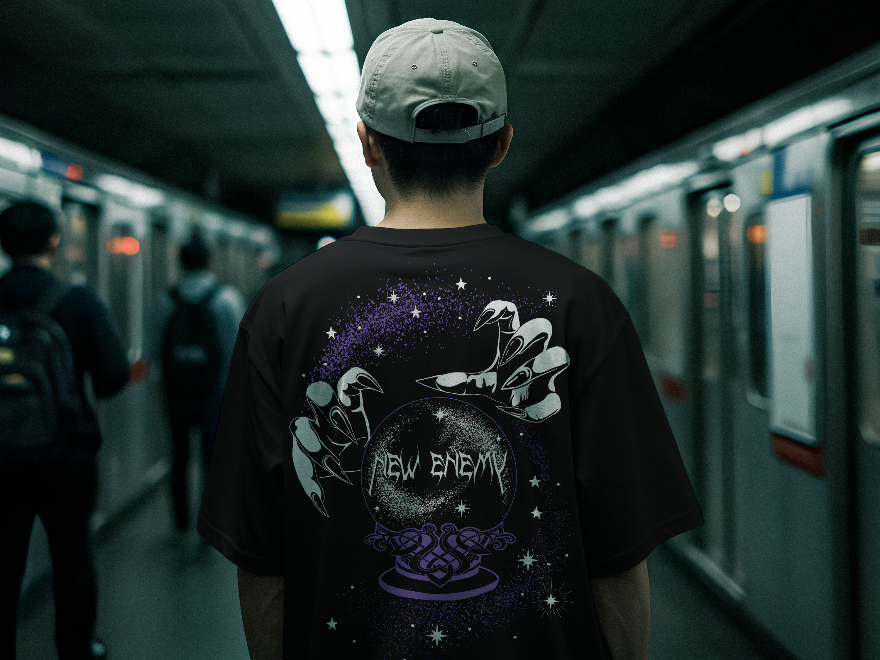
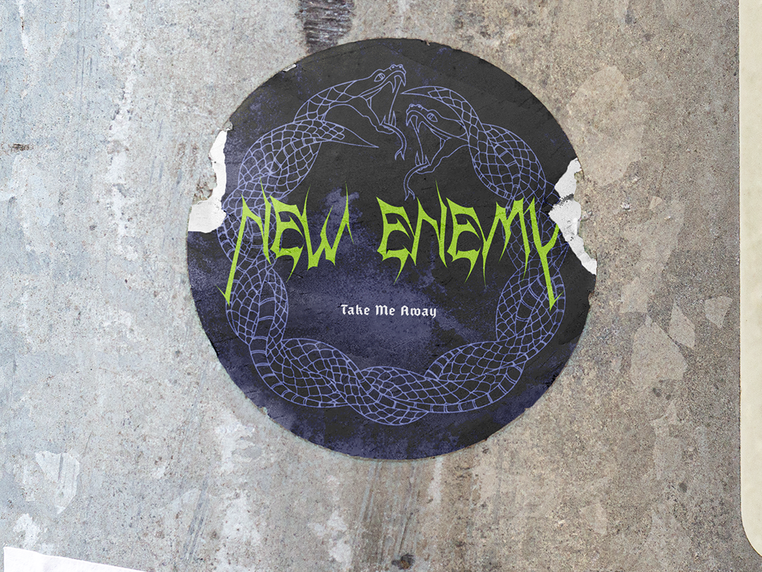
New Enemy
"If these four walls could speak, you wouldn't hear a sound"
New Enemy is a Dublin based alternative rock band known for their explosive sound, genre bending intensity and exhilarating live shows that leave the walls of a venue shaking and cracked long after they’ve played.

Concept
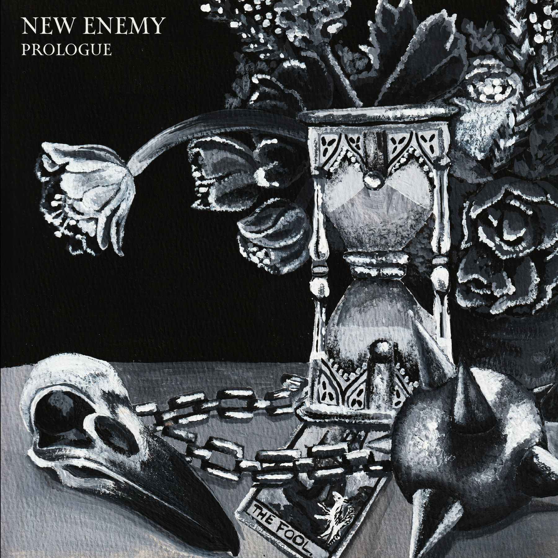
Prologue is New Enemy's debut EP. The band set to release each of the 5 songs as singles over the year 2026. Front woman, Ash McCann wrote the majority of the songs throughout her early 20s with members who were no longer part of the ensemble.
Although the songs are a staple of the current band make up, they feel quite disconnected from the work as it was written so long ago. The premise of this EP was to present the early work as an amalgamation or snapshot.
"This unforgettable penetrable lyricism and sound is penned by the front woman Ashley, who along with her band mates have discovered a new way to open the mosh pit with iconic guitar solos, earth shattering screams and musical dynamics that build suspense just long enough to have your nervous system aching and wanting more."
Ash presented the idea of having the cover as a detailed still life painting, with each object in reference to the singles.
I painted the artwork using gouache paints on 300gsm paper. Focusing on adding texture and thoughtful details so that each cover would be a unique art piece.
I used a minimal, sleek font with angular shapes to mimic their metal style logo. As each single was released, the artwork served as a puzzle for fans to piece together before finally the EP cover was released.